The Power of a Simple Yet Bold Identity
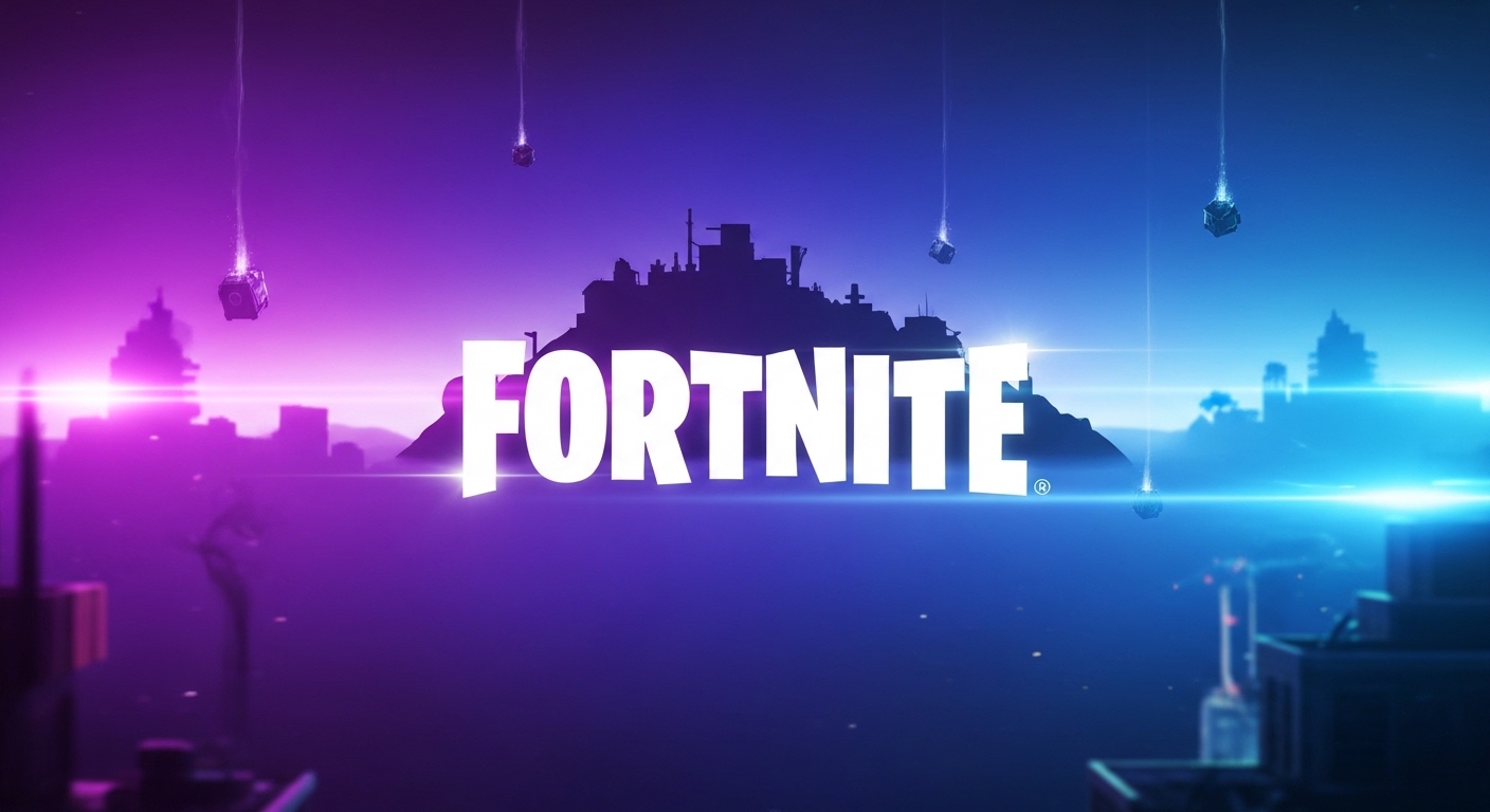
The Fortnite logo is more than a title graphic placed above the game menu; It’s a visual identity that has become deeply rooted in modern gaming culture. From eSports tournaments to social media memes, YouTube thumbnails to merchandise worn by millions, logos instantly signal excitement, competition and creativity. In a crowded digital entertainment market where thousands of games are vying for attention, it’s important to stand out. The genius of the Fortnite logo lies in its simplicity, legibility and bold personality, which together create an unforgettable first impression.
What makes a gaming logo truly recognizable is not only the quality of the design, but also the repetition, the cultural impact and the emotional connection. Fortnite has achieved all three of these in a big way. The game’s explosive popularity transformed the brand into a global symbol of online multiplayer entertainment. As a result, the Fortnite logo became synonymous with the Battle Royale revolution, influencing not only players, but also designers, marketers, and competing game developers who study the brand’s success.
Typography That Feels Playful and Powerful
One of the most important elements behind the success of the Fortnite logo is the typography. Bold, blocky, slightly irregular letters give it a playful but powerful look. Unlike the overly serious military-style font used in many shooters, Fortnite opted for a style that feels energetic and slightly cartoonish. This option reflects the game’s creative building mechanics and vibrant aesthetic. Typography plays an important role in game branding, and Fortnite’s font communicates accessibility without sacrificing intensity.
The letters appear strong and wide, they confidently fill the space and remain easy to read even from a distance. Whether displayed on a small mobile screen or a giant eSports arena screen, the logo maintains clarity. This scalability strengthens its visual presence. Due to its distinctive shape and texture, players can recognize the Fortnite logo even when partially cropped into a thumbnail or advertising banner, dramatically increasing brand recall.
Color Psychology and Visual Impact
Another important reason why the Fortnite logo stands out in gaming culture is its color. While the main logo is often displayed in white or black for versatility, it is usually placed on a vibrant purple, blue or high-contrast background. These colors represent energy, imagination and digital immersion. In the world of eSports identification, strong contrast ensures immediate visibility on streaming platforms and tournament broadcasts.
The game itself is known for its bright atmosphere and dynamic visual effects, and the logo complements this universe perfectly. Instead of relying on the dark, gritty tones common in shooters, Fortnite adopts a vibrant color palette. This strategic alignment between in-game graphics and logo presentation creates a cohesive brand experience. When players see the logo, they subconsciously associate it with the colorful chaos of battles, character skins and creative maps.
Cultural Relevance Beyond the Game
The Fortnite logo transcends its role as a simple identifier as the game itself has become a cultural phenomenon. Celebrity collaborations, in-game concerts, crossover events with Marvel and Star Wars, and viral dance sensations pushed Fortnite into mainstream entertainment. Each collaboration enhanced the logo’s visibility in industries such as music, film and fashion.
When a brand expands beyond its core product, its visual identity gains symbolic power. The Fortnite logo is no longer seen as just a game symbol, but as a representation of digital youth culture. Teenagers use it on hoodies, content creators use it in thumbnails, and eSports teams display it during tournaments. This continued exposure reinforces familiarity, and familiarity creates identity.
Consistency Across Platforms
Another reason why the Fortnite logo is instantly recognizable is consistency. Whether on a PC launcher, console dashboard, mobile app or physical goods, the visual identity remains largely unchanged. Continuity is a fundamental rule of successful video game marketing because it builds trust and long-term recall.
Epic Games has kept the original design of the logo despite seasonal updates and map changes in the game. While in-game themes are constantly evolving, the logo acts as a stable anchor. Players can experience new skins, weapons and co-ops every season, but the branding remains relatable. This balance between innovation and sustainability strengthens its long-term impact.
Emotional Connection with Players
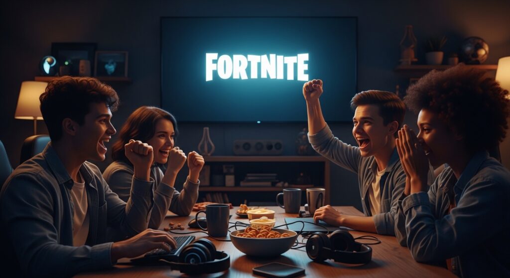
Identity is not purely visual; It’s emotional. Millions of players associate the Fortnite logo with memories of late games, clutch wins and fun times with friends. Emotional attachment increases memorability considerably. When players see the logo, they often remember intense matches or exciting live events.
The rise of streaming platforms improved this relationship. Streamers often display logo overlays, thumbnails and titles, enhancing brand exposure. As a result, even non-players recognize the symbol through cultural osmosis. Emotional resonance combined with repeated visibility makes the logo unforgettable in global gaming environments.
The Role of Minimalism in Modern Branding
In today’s digital age, minimalism often trumps overly complex designs. The Fortnite logo follows a clean and straightforward structure without unnecessary details. This simplicity means that it can be easily adapted to digital and physical spaces. From app icons to billboards, the design remains crisp and effective.
Minimalistic logos are easy to reproduce, animate and change for events. Fortnite sometimes stylizes the logo for seasonal campaigns, but the basic structure remains intact. This adaptability ensures that even if the presentation evolves, the recognition factor will never weaken. Many brands strive for complexity, but Fortnite demonstrates how clarity and boldness drive stronger long-term recognition.
Comparison With Other Gaming Logos
To better understand why the Fortnite Logo is so recognizable, it helps to compare it with other major gaming franchises. The table below highlights key branding differences that influence recognition levels.
| Feature | Fortnite | Call of Duty | Minecraft | Apex Legends |
| Typography Style | Bold, playful block font | Military-inspired strong font | Pixel-style block font | Sharp, modern sans-serif |
| Color Flexibility | High contrast, vibrant backgrounds | Mostly dark and metallic | Earthy and pixel tones | Red and black tones |
| Cultural Collaborations | Extensive crossovers | Limited collaborations | Moderate brand tie-ins | Occasional events |
| Visual Simplicity | Very high | Medium | High | High |
| Youth Appeal | Extremely strong | Moderate | Strong | Strong |
This comparison shows that Fortnite’s branding leans heavily into playful boldness and cultural expansion, which increases memorability. While other games have strong identities, the Fortnite Logo benefits from a broader entertainment presence.
Digital Era Visibility and Social Media Power
Social media plays an important role in shaping modern brand identity. The Fortnite logo appears daily on platforms such as YouTube, TikTok, Instagram and Twitch. Every tournament highlight, game clip and reaction video reinforces the visual identity. Because Fortnite thrives on shareable content, the logo organically runs through millions of posts.
Hashtags, profile banners and thumbnails often include branding. Repetition creates a psychological impression. In digital marketing, cognitive engagement is strengthened by repeated exposure. As Fortnite content spreads globally, the logo becomes embedded in the minds of active players and casual viewers alike.
Merchandise and Offline Recognition
A logo becomes truly iconic when it crosses the screen. The Fortnite logo is printed on clothing, backpacks, gaming accessories and collectibles around the world. Goods turn digital branding into concrete identity. When fans wear branded clothing, they become walking advertisements, increasing visibility in the real world.
Offline exposure adds another layer of identity. Children recognize it in toy stores, teenagers see it in school hallways, and event attendees see it at game shows. This offline boost reinforces the notion that Fortnite is not just a game, but a lifestyle brand.
Adaptability in Esports and Live Events
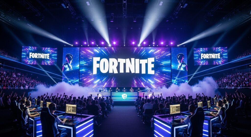
In competitive gaming, strong visual identity means a lot. The Fortnite logo works exceptionally well on the big screen during tournaments and championships. Its thick handwriting ensures legibility even on large areas. Clear branding supports team banners, promotional posters and streaming overlays without losing visual power.
Live in-game concerts and global tournaments boosted this attendance. Millions of people watched events where the logo served as the central visual anchor. The combination of entertainment spectacle and consistent branding elevated its status from simple game title to a globally recognized eSports icon.
Psychological Simplicity and Instant Recall
The human brain processes bold shapes faster than complex patterns. The Fortnite logo uses bold, uniform letters that can be recognized within seconds. Quick recall is important in crowded digital markets. When browsing app stores or streaming platforms, viewers immediately recognize familiar shapes.
The psychological theory of visual memory explains this phenomenon. Simple geometric shapes are easy to store and retrieve from memory. Because Fortnite avoids excessive detail, its identity remains strong even in low-resolution previews or small icons. This design intelligence contributes greatly to its cultural dominance.
Influence on Modern Gaming Branding
The success of the Fortnite logo influenced other developers to rethink their branding strategies. Many new multiplayer titles now support bold typography and simplified textures. Fortnite demonstrated that a fun, accessible aesthetic can outperform overly aggressive designs when it comes to attracting younger audiences.
Brand identity is no longer just about seriousness or realism; It’s about relatability and sharability. Fortnite’s approach proved that games could feel social, creative and mainstream at the same time. The logo represents this change in industry philosophy, making it not only recognizable but also historically significant.
A Symbol of the Battle Royale Era
The rise of battle royale games defined a generation of online competitions. The Fortnite logo became one of the strongest visual symbols of this era. Even people who have never played the game often associate it with the explosive popularity of survival-style multiplayer experiences.
As trends evolve, some games fade into nostalgia, but Fortnite continues to reinvent itself through seasonal updates and collaborations. Because the logo remains consistent as the content evolves, it forms the foundation for the longevity of the brand. It’s a reminder of the game’s impact on global gaming culture.
Conclusion
The reason why the Fortnite logo is so recognizable in gaming culture is due to the combination of bold typography, vivid visual alignment, emotional connection, social media dominance, consistent branding and cultural expansion beyond gaming. It is not just about the quality of design, but about strategic execution and community involvement.
Through intelligent game branding, a strong eSports identity and innovative video game marketing, Fortnite transformed a simple wordmark into a global icon of entertainment. The simplicity of the logo is instantly memorable, while its cultural presence guarantees long-term relevance. As games continue to evolve, the legacy of Fortnite’s brand strategy will remain a benchmark for future developers aiming to achieve worldwide recognition.
