Color is not just a decorative element; It is a silent language that communicates emotion, energy and intention without using words. Among all colors, orange has a unique position due to its warmth, life and emotional charge. When people ask whats the opposite of orange, they are not just looking for a technical answer from the color wheel, but an emotional and visual contrast that explains why some colors feel calming while others feel energizing. This question opens the door to a deeper discussion about warm and cool colors and how they shape human perception in art, branding, interior design and psychology.
Understanding color contrast helps explain why some rooms feel peaceful while others feel stimulating. The difference between warm and cool colors affects mood, behavior and even decision making. Discovering whats the opposite of orange helps us understand how color balance works emotionally and visually, which explains why designers, artists and marketers rely so heavily on this contrast to communicate specific messages.
Orange as a Warm and Energetic Color
Orange is a color deeply associated with warmth, enthusiasm and dynamism. It combines the intensity of red with the optimism of yellow, creating a color that feels alive and expressive. Emotionally, the color orange creates feelings of excitement, friendliness and confidence. Visually, it demands attention, making it a popular choice for call-to-action buttons, sports branding and energetic environments.
When researching whats the opposite of orange is, it is important to first understand the emotional personality of orange. The color orange is stimulating and extroverted, encouraging social interaction and activity. There is a sense of urgency, but without the aggression of red. This warmth places orange well within the warm color spectrum, setting the stage for the contrast with cooler, calmer colors that create emotional balance.
The True Opposite of Orange on the Color Wheel
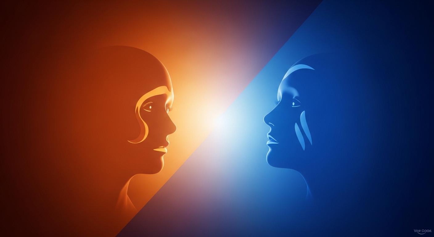
From a technical perspective, whats the opposite of orange on the color wheel is blue. This pairing is known as a complementary color relationship, where two colors sit directly opposite each other. When placed together, they amplify each other’s intensity while maintaining contrast. This scientific explanation answers whats the opposite of orange is in a visual sense, but the emotional implications are much deeper.
Blue represents peace, stability and introspection, which is the direct opposite of orange’s energetic and expressive nature. While orange feels warm and moving forward, blue feels cool and pulling. This dichotomy explains why blue is often associated with trust and reliability, making it a favorite in corporate branding, while orange is used to inspire action and creativity.
Emotional Contrast Between Warm and Cool Colors
The emotional distinction between warm and cool colors is one of the most powerful tools in visual communication. Warm colors such as orange stimulate the nervous system, creating excitement and emotional intensity. Cool colors, especially blue, lower the heart rate and promote relaxation. This emotional opposition explains why people intuitively associate orange with activity and blue with calm.
When analyzing whats the opposite of orange is, the emotional response becomes clear through this contrast. Orange energizes and engages, while blue calms and soothes. This is why healthcare environments often rely on a cooler color palette, while entertainment or youth-focused spaces prefer warmer colors. The emotional impact of color is subtle yet profound, affecting people’s emotions without conscious awareness.
Visual Impact and Spatial Perception of Orange vs Blue

Visually, warm and cool colors behave very differently in the room. The orange color appears to move towards the viewer, making objects feel closer and more prominent. Blue, on the other hand, seems to recede, creating a sense of depth and openness. This visual behavior supports the idea that whats the opposite of orange is inherent in both perception and emotion.
Designers often use this contrast strategically. Orange can make a room feel intimate and energetic, while blue expands visual boundaries and radiates calm. This is why landscapes often have cool blues in the background and warm tones in the foreground, which naturally lead the viewer’s eye through the composition.
Psychological Associations of Orange and Its Opposite
Color psychology plays an important role in how individuals respond emotionally to visual stimuli. The color orange is associated with optimism, creativity and inspiration. It can improve mood and encourage social interaction, making it ideal for collaborative environments. However, too much orange can look overwhelming or messy.
Exploring whats the opposite of orange through psychology shows that blue is emotional imbalance. Blue is associated with trust, intelligence and emotional stability. It reduces stress and promotes focus, which is why it dominates professional and institutional settings. Together, these colors show how emotional balance can be achieved through contrast rather than uniformity.
Cultural Interpretations of Orange and Blue
Cultural context also determines how colors are perceived. In many cultures, orange symbolizes vitality, spirituality or celebration, while blue represents peace, wisdom and protection. These meanings reinforce the emotional opposition between the two colors and help explain why the question of whats the opposite of orange extends beyond design theory to cultural symbolism.
In Eastern traditions, orange is often associated with transformation and enlightenment, while blue symbolizes immortality and depth. In Western contexts, orange reflects enthusiasm and friendliness, while blue reflects professionalism and trust. Despite cultural differences, emotional conflicts remain the same in all societies.
Warm vs Cool Colors in Branding and Marketing
Branding relies heavily on emotional cues, and the choice of color is one of the most influential factors in shaping brand identity. Orange brands often aim to appear youthful, energetic and approachable. In contrast, blue marks focus on reliability, calmness and authority. This strategic use of color shows the practical application of orange contrast in business.
Companies rarely choose colors randomly. Instead, they use warm and cool contrasts to communicate values and evoke specific emotional responses. The orange color grabs attention and inspires action, while the blue color builds trust and encourages long-term commitment. Understanding this dynamic helps explain why these colors are rarely interchangeable.
The Role of Color Contrast in Emotional balance

Visual harmony often depends on contrast rather than similarity. Using both warm and cool colors creates emotional balance, preventing the design from feeling too aggressive or too passive. Orange and blue together create a dynamic yet visual experience, showing how opposites can complement rather than compete.
When people ask whats the opposite of orange is, they often intuitively search for balance. Cool colors provide a respite from the intensity of warm colors, allowing the viewer to relax emotionally. This balance is essential to create an environment that is both attractive and comfortable.
Emotional and Visual Differences Between Orange and Blue
| Aspect | Orange (Warm Color) | Blue (Cool Color) |
| Emotional Impact | Energetic, enthusiastic, social | Calm, stable, introspective |
| Visual Behavior | Advances toward viewer | Recedes into space |
| Psychological Effect | Stimulates activity and creativity | Reduces stress and builds trust |
| Common Usage | Marketing, entertainment, calls to action | Corporate branding, healthcare, technology |
| Mood Association | Excitement and warmth | Peace and reliability |
How Color Psychology and Contrast Shape Emotional and Visual Experience
The concept of color psychology helps explain why emotional responses to orange and blue seem so natural and intuitive. The human brain is designed to respond to color cues on the basis of survival, memory and emotional conditioning. This psychological framework strengthens the understanding of whats the opposite of orange is more than a visual response.
The theory of warm versus cool colors further clarifies how the perception of temperature affects emotional state. Warm colors energize, while cool colors are calming, creating a rhythm that designers and artists rely on. In addition, visual perception in design explains how color contrast affects depth, focus and movement, making orange and blue one of the most powerful opposing pairs in visual communication.
Conclusion
The question of whats the opposite of orange leads to a deeper understanding of how color shapes emotions, perception and experience. While blue is the technical and emotional opposite of orange, the real value lies in recognizing how warm and cool colors interact to create balance. Orange energizes and engages, while blue calms and soothes, creating a partnership that defines the visual and emotional design.
By understanding this paradox, designers, marketers, and everyday individuals can make more intentional choices in how they use color. Whether you’re shaping a brand identity, designing a living space, or creating visual art, recognizing the emotional and visual contrast between orange and blue will make for a more powerful and meaningful use of the color.